
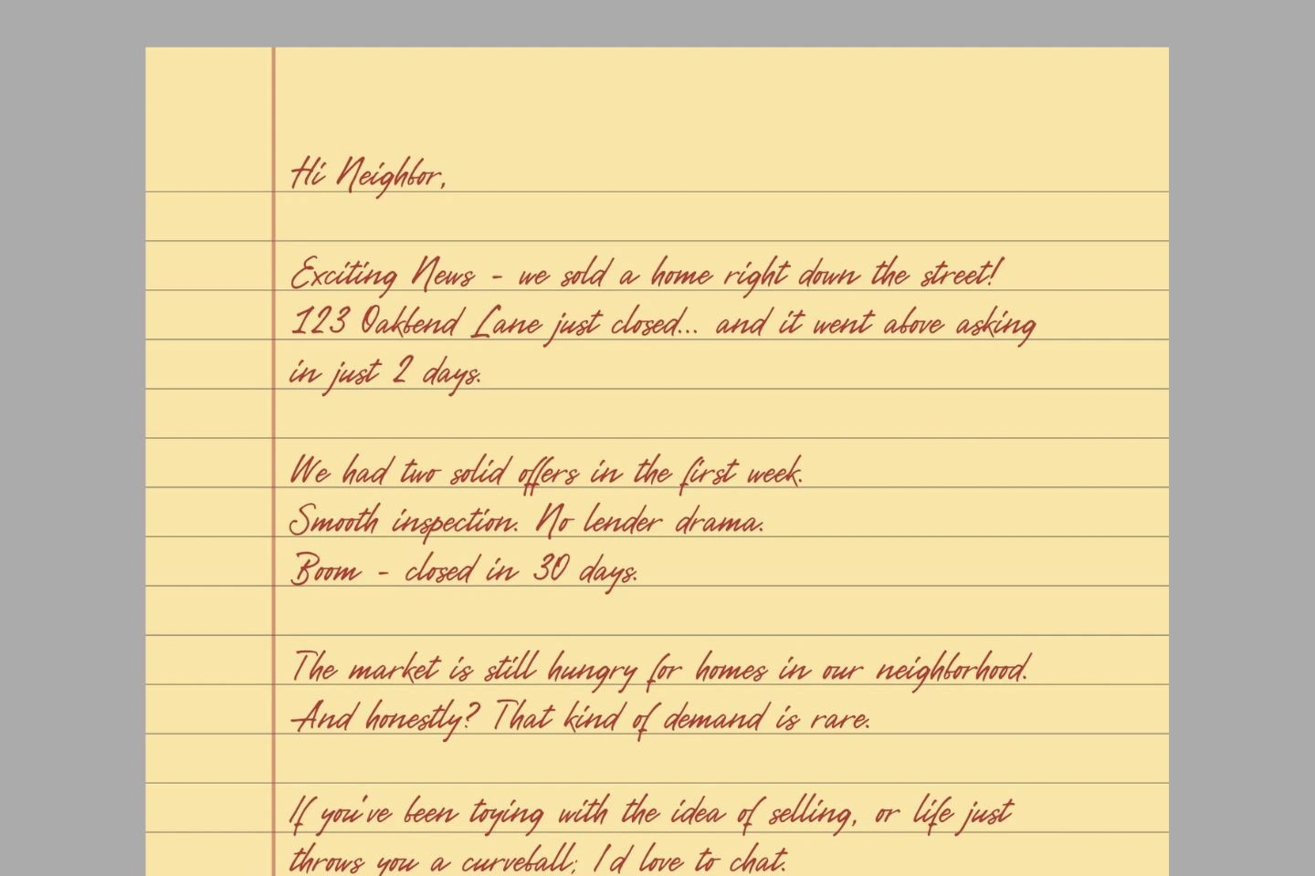
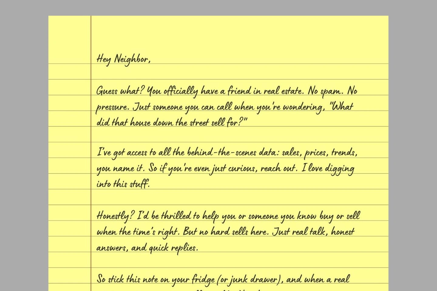
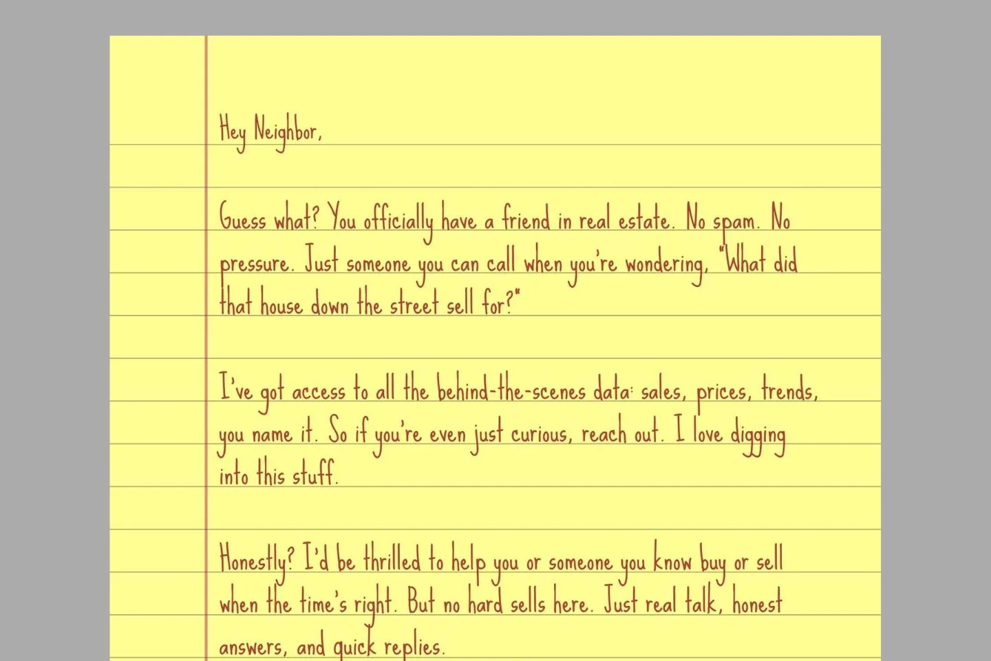
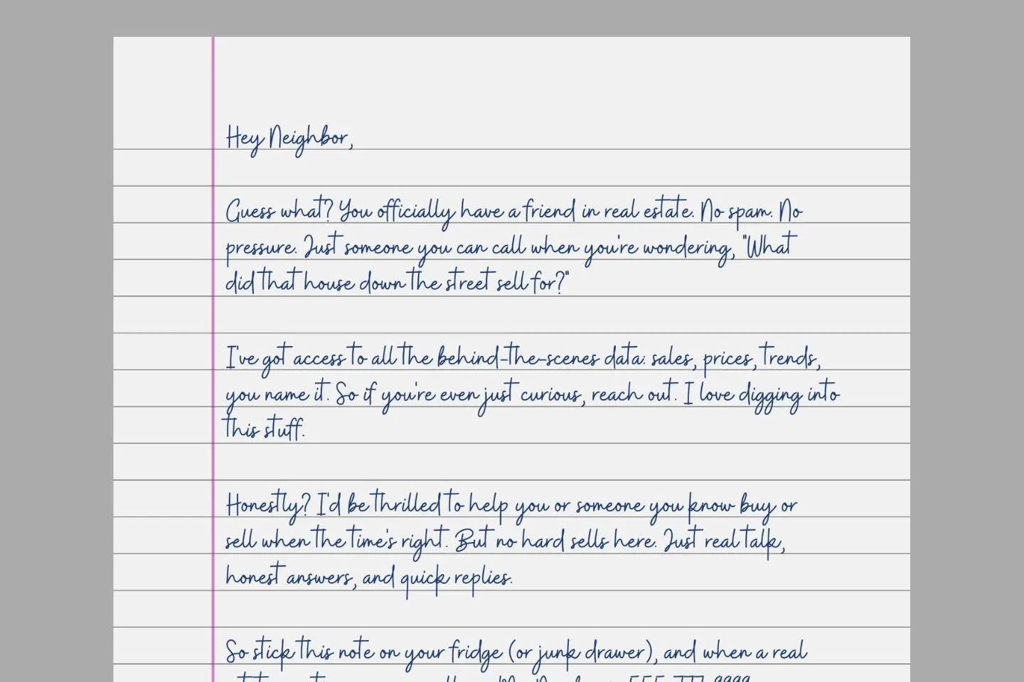
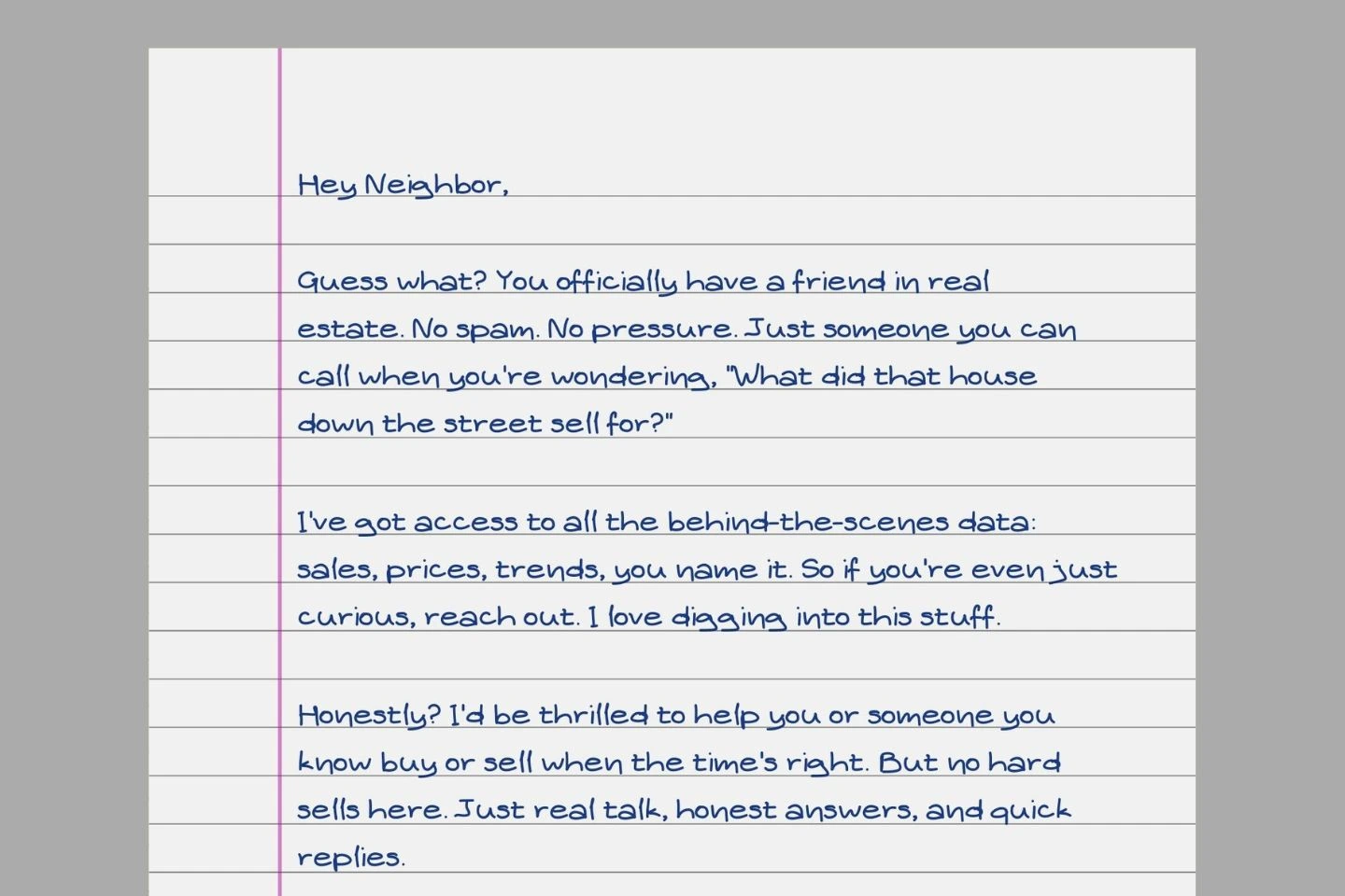
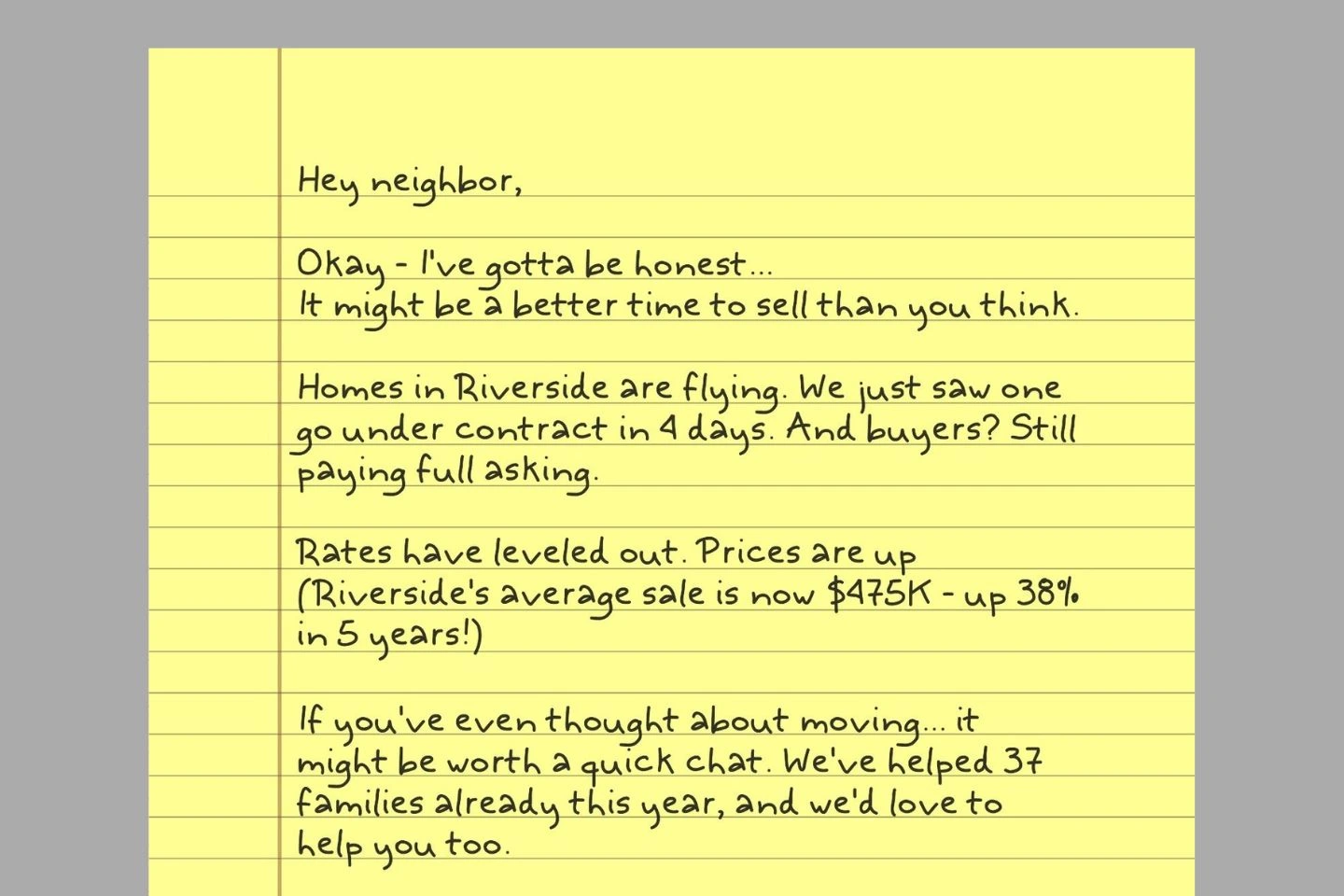
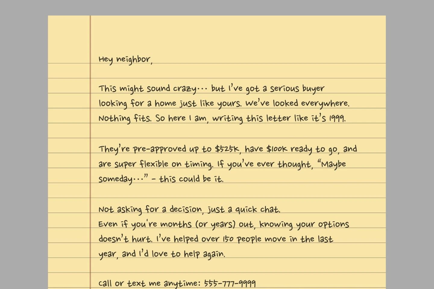
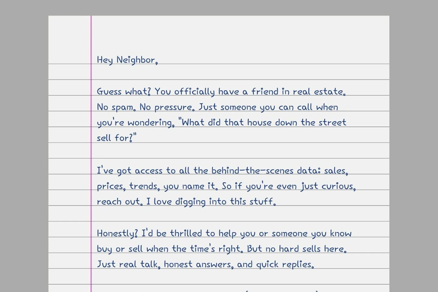
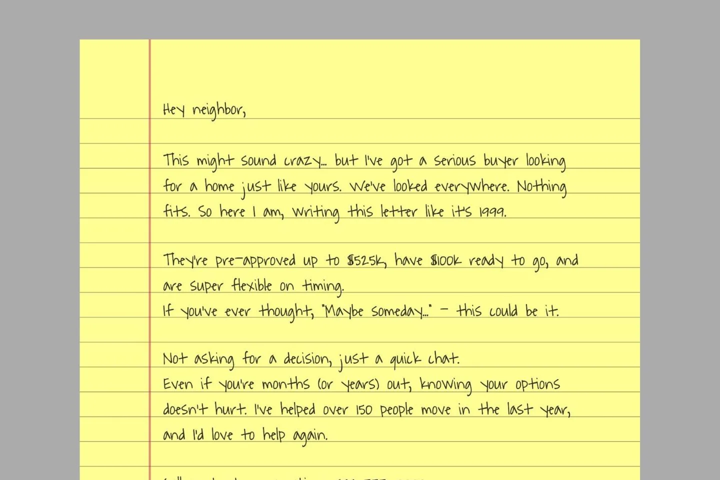
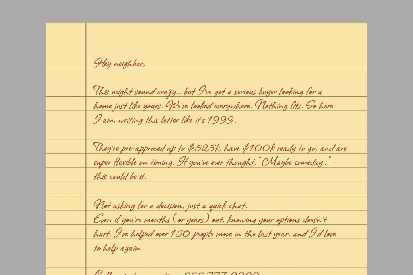
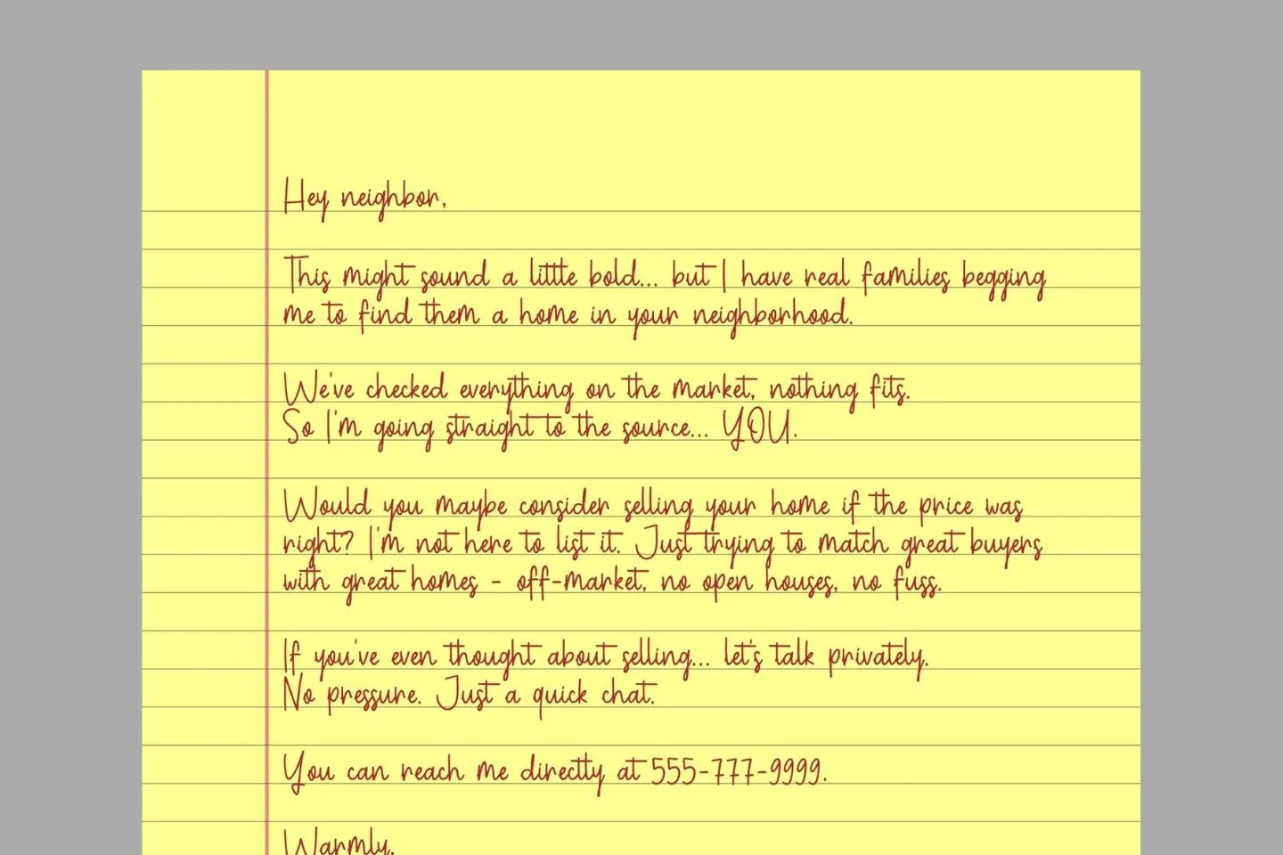
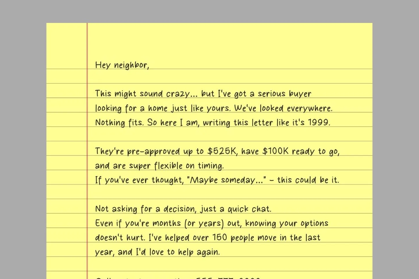
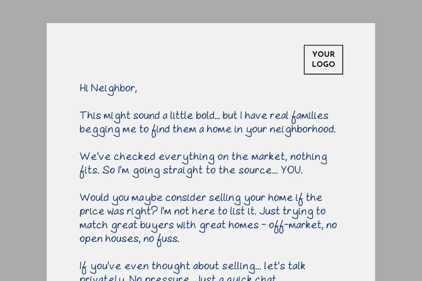
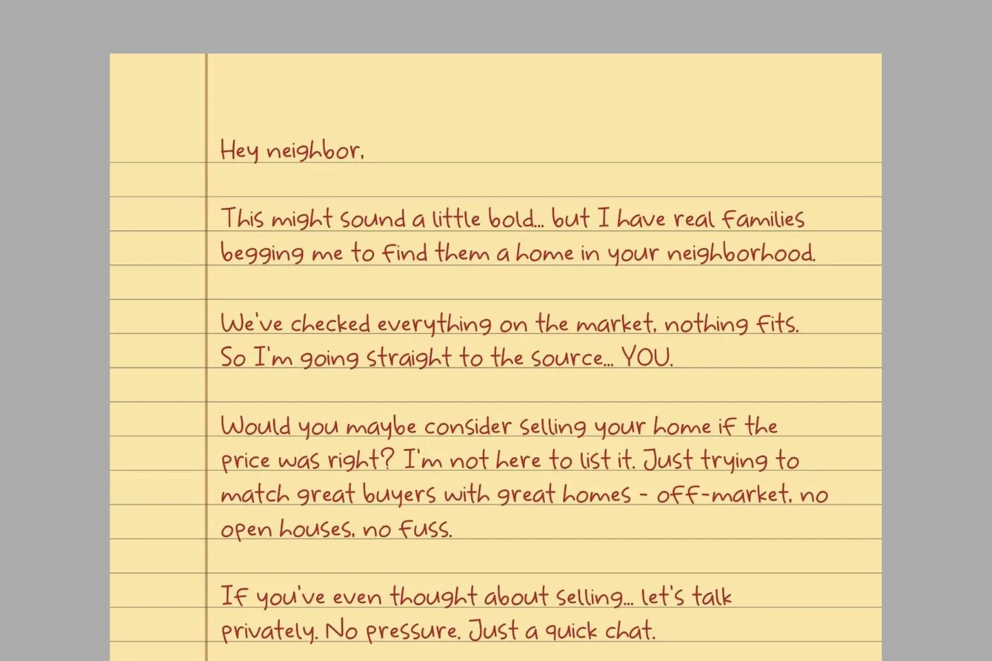
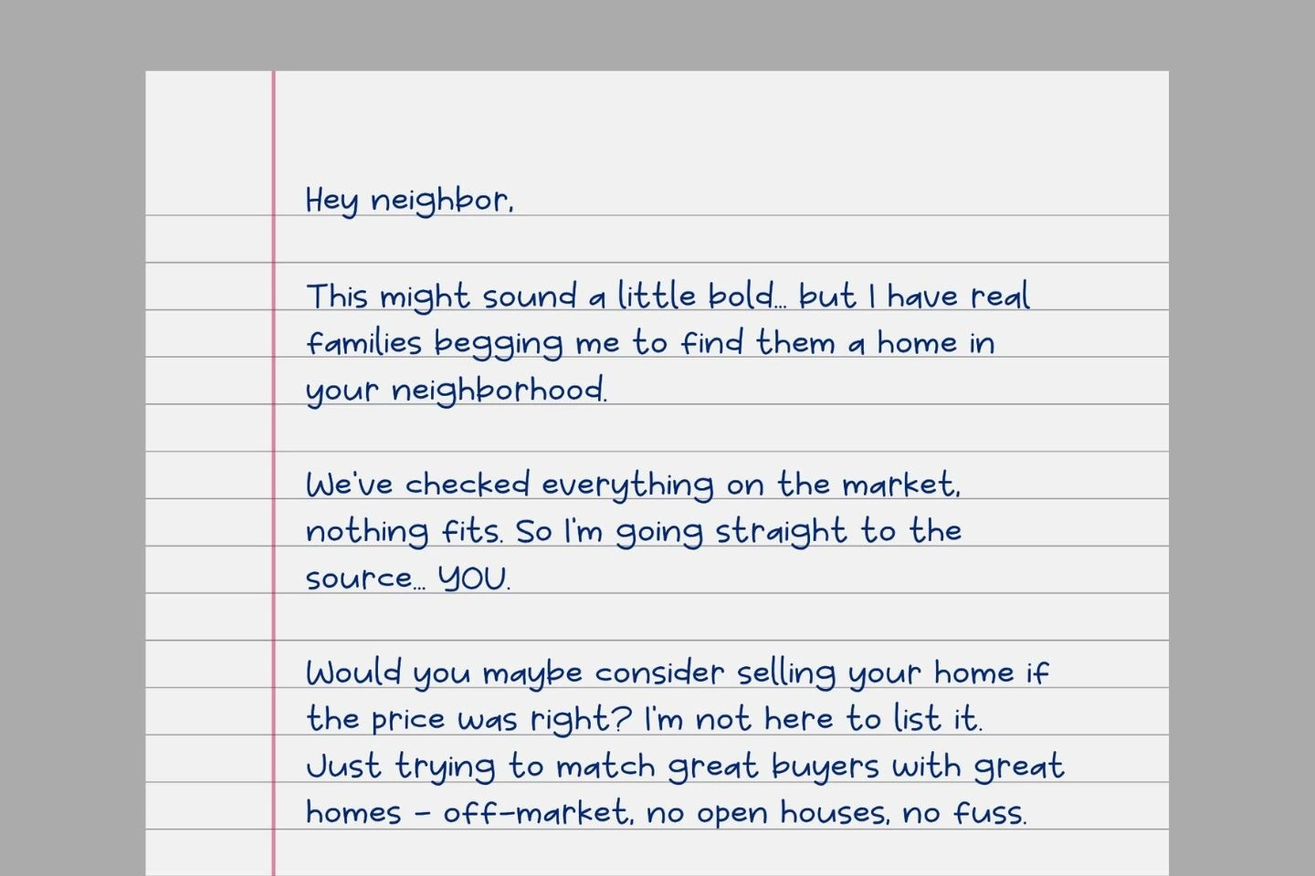
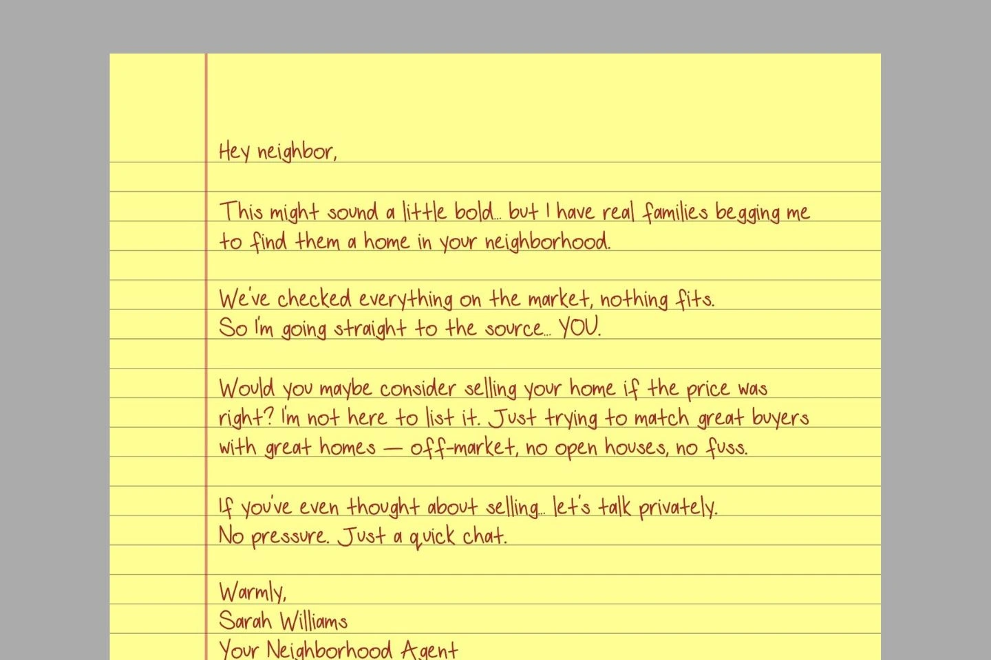
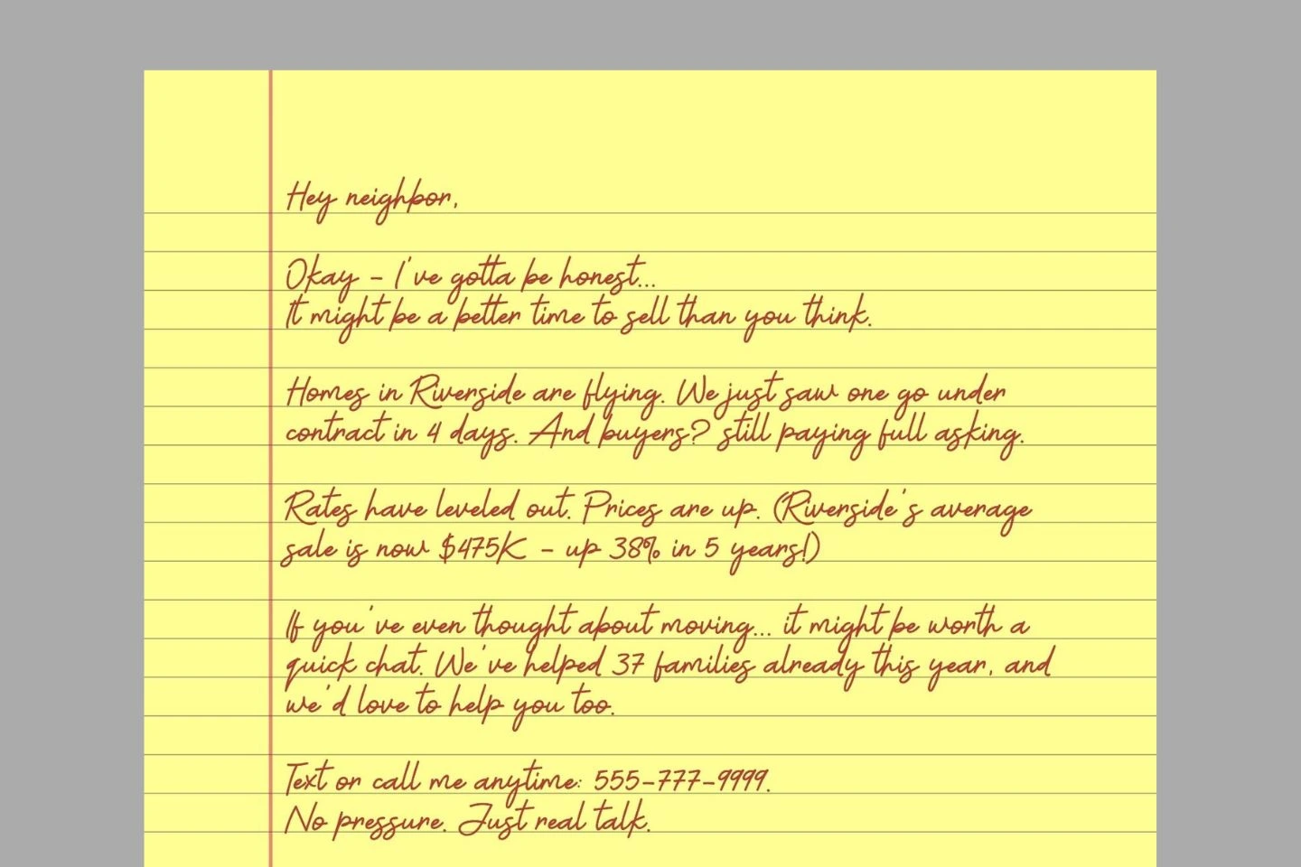
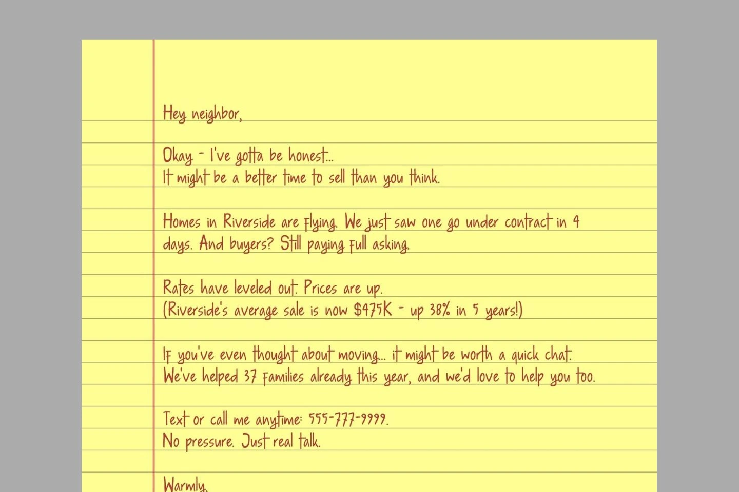
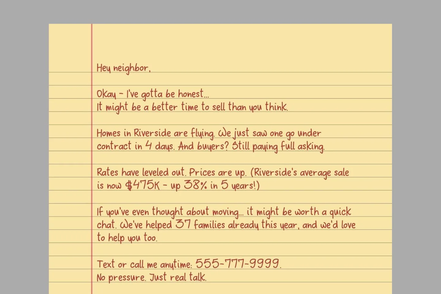
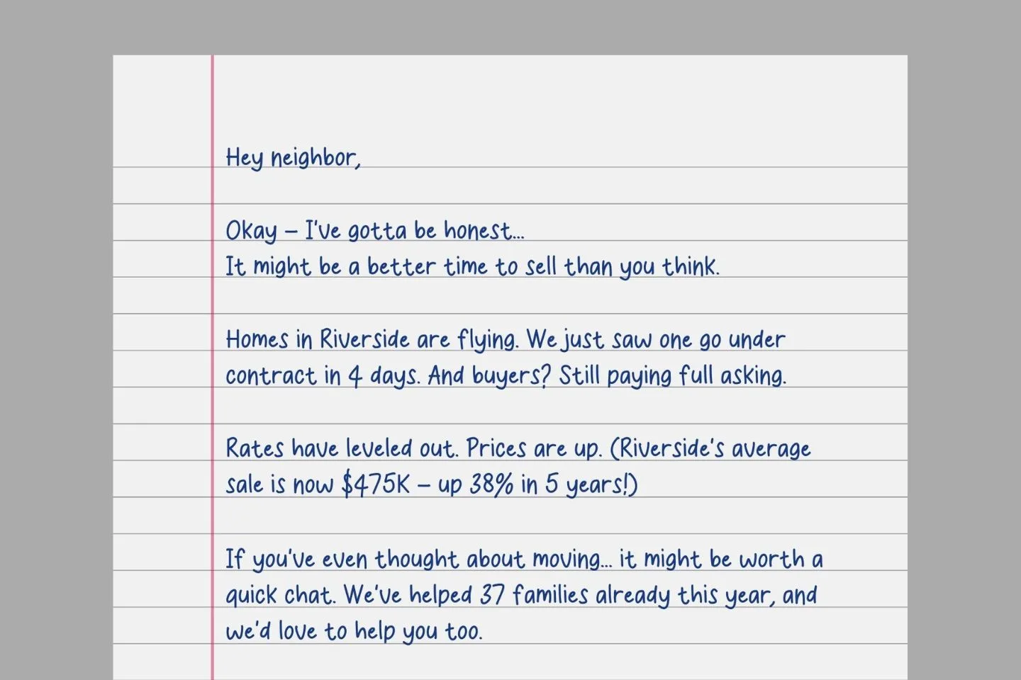
There’s just something about handwritten letters. It feels real, personal, like you actually took the time to write it, even if we both know you typed it and used a great font.
That kind of authenticity matters in real estate. Whether you’re farming a neighborhood, reaching out to off-market owners, or trying to match a serious buyer with the right seller, a handwritten letter can warm people up in ways no marketing postcard ever could.
The good news? You don’t need actual handwriting skills (mine are terrible) or to spend hours writing hundreds of notes. The right font can give you that authentic personal touch while saving your hand from cramping. A font that looks handwritten, but still reads clean. Not too fancy. Not too childish. Just real, legible, and a little bit human.
I’ve pulled together 36 of my absolute favorite handwritten fonts that you can use totally free in Canva.
Grab your coffee (or your cocktail), and let’s scroll through some font magic.
Canva Fonts
I assume you’re using Canva to design your letters (smart move – it’s fast, easy, and gets the job done plus you can download the sample letters for free). These are my top picks of handwritten fonts already baked into Canva.
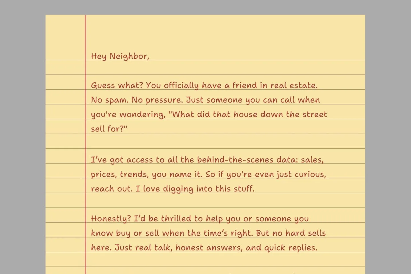
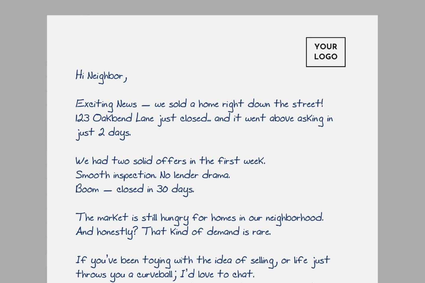
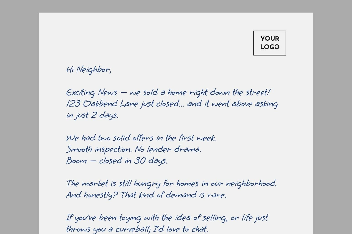
1. Gloria Hallelujah
This font looks like it was scribbled with a slightly messy hand, giving it that authentic “I just wrote this note to you” feel. It’s perfect for casual neighborhood letters where you want to come across like a real human (not a corporate flyer in disguise).
2. Gochi Hand
Gochi Hand has this fun, slightly rounded character that makes your letters feel warm and friendly. It’s got enough personality to catch attention without being too “out there.” It strikes that perfect balance between professional and personal.
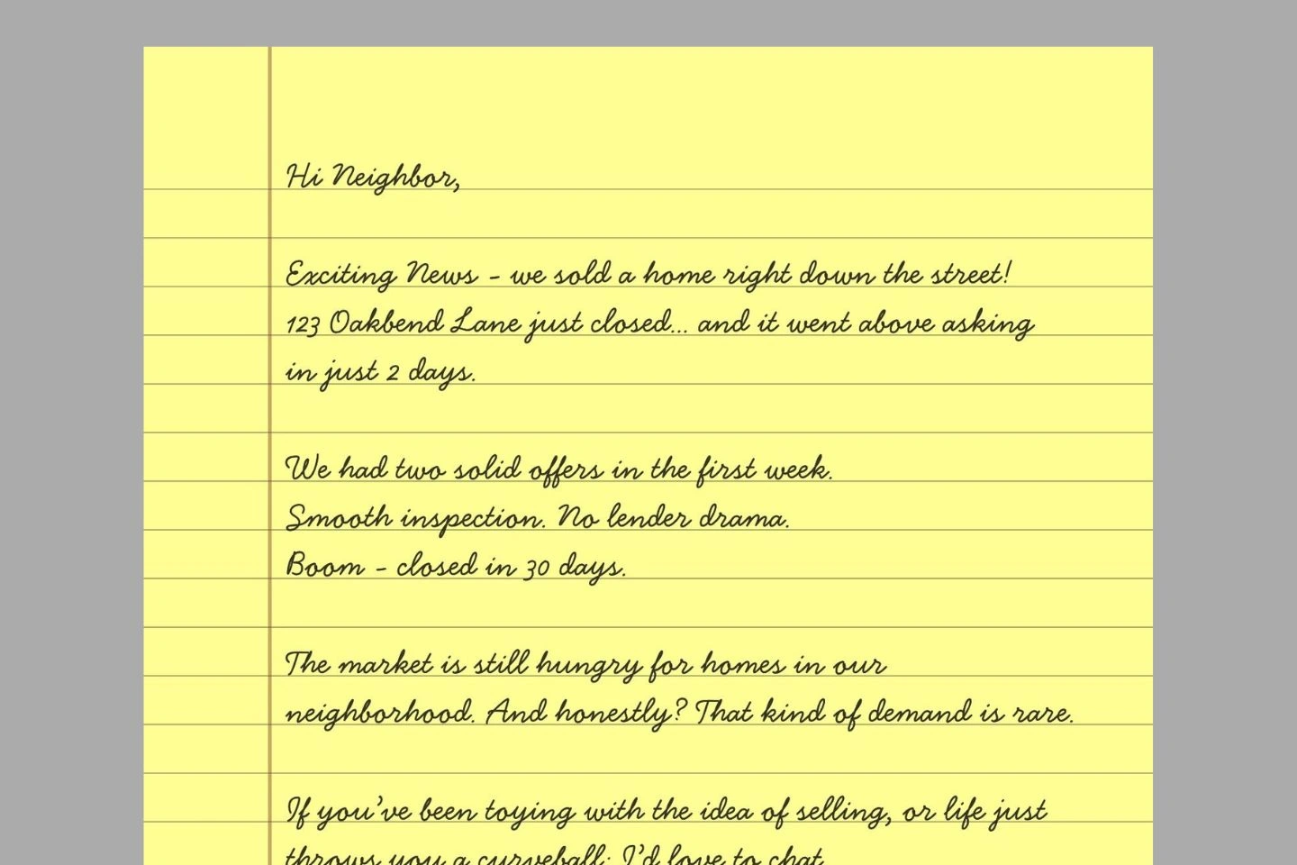
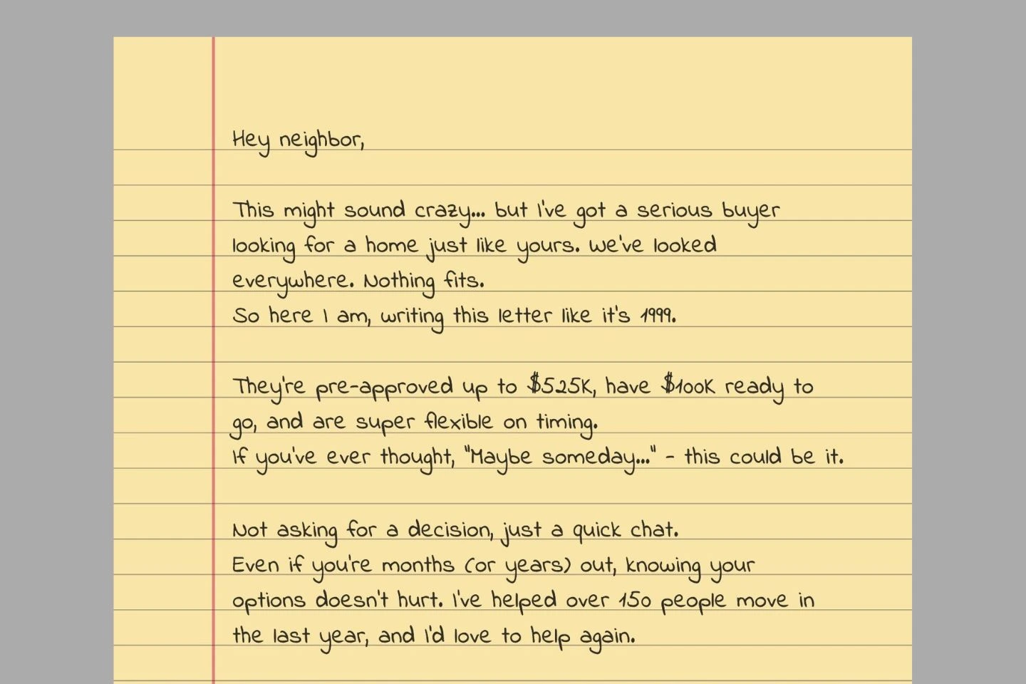
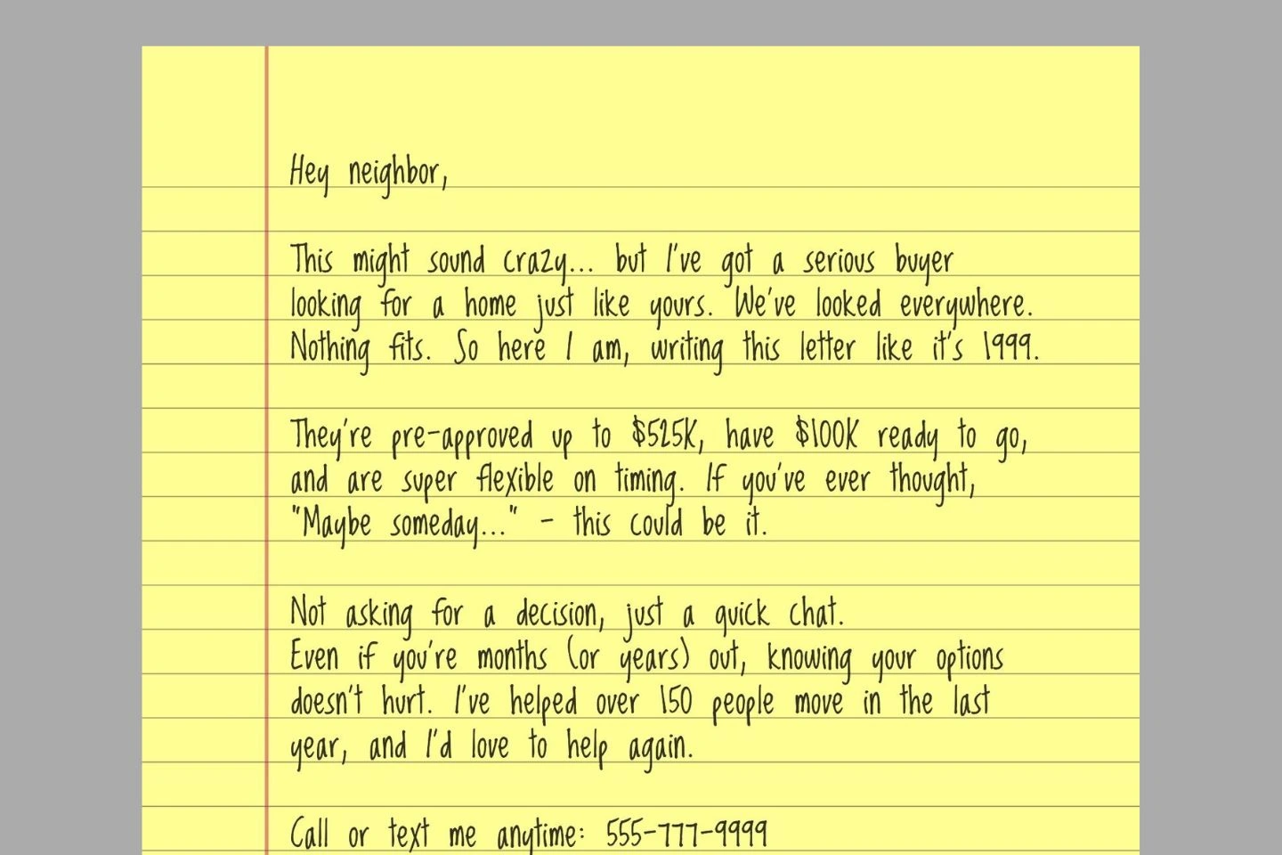
3. Caveat
Caveat looks like it was written by someone with really nice handwriting. It’s smooth, friendly, and super easy to read which is a big win when you’re trying to catch attention in a pile of junk mail. Caveat feels natural without looking too polished.
4. Bellaboo
This font has a fun, bouncy quality that stands out in mailboxes. The slightly irregular baseline makes it look like you actually wrote it in a moment of enthusiasm. It’s perfect for announcing good news like a nearby sale or when you want to inject some energy into your farming efforts.
5. Gentlemens Script
When you need something with a touch more class, Gentlemens Script delivers. It has this elegant quality that works beautifully for higher-end neighborhoods or when you’re positioning yourself as a luxury agent. Despite being fancy, it still maintains that handwritten authenticity that gets letters opened.
6. Lumios Marker
This font looks exactly like it was written with a real marker on paper. It’s bold and makes a statement, which is perfect for letters where you need to communicate confidence. Works great for letters where you want to establish yourself as the neighborhood authority.
7. Sue Ellen Francisco
Imagine someone with long loops and soft curves in their penmanship, that’s Sue Ellen Francisco. It feels handwritten in the best way. A little messy, but not chaotic. Like you took your time writing it, not just copy-pasting a template.
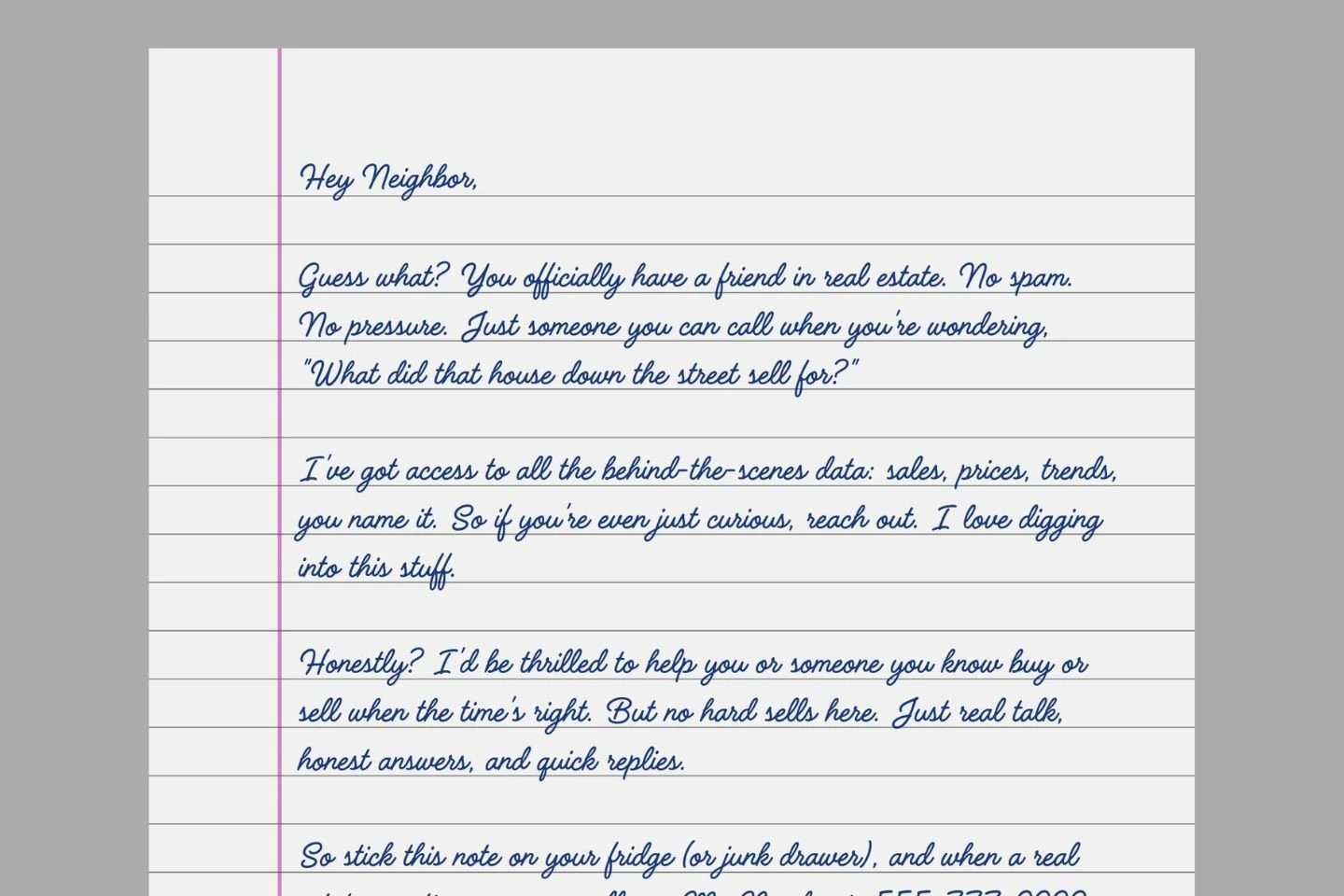
8. Buffalo (Pro)
This Canva Pro font is worth mentioning because it has this confident, slightly artistic flair that makes your letters look like they came from someone creative and thoughtful. The varying line weights make it look like you used a real fountain pen.
9. Shantell Sans
This one’s a newer Canva font and it’s kind of a gem. Casual, fresh, and super legible. It leans more toward “neatly printed block letters” than cursive or script, which makes it great for folks who want that handwritten vibe without going full swirly.
10. Handsome
Has a smooth, clean flow and mimics real handwriting without getting too messy or wild. It feels like something a well-organized, thoughtful friend would leave on your doorstep, the exact tone you want in your real estate letter.
11. Handelson Three
Brings a slightly messy, sketchbook-like charm to the table, in the best way possible.It feels raw and human, almost like it came from a notebook scribbled during a morning coffee. That’s what makes it great for farming letters: it doesn’t look like a mass printout.
12. Schoolbell
If you’re aiming for cheerful and neighborly, Schoolbell is your go-to. Inspired by the kind of handwriting you’d see on a chalkboard or a kid’s homework – playful, round, and super friendly.
13. Architects Daughter
Has that “smart but chill” feel. Clear, easy to read, but still handwritten enough to stand out in a pile of mail. Architects Daughter has just the right amount of personality without being dramatic.
14. Six Hands Marker
A bold, marker-style font that pops off the page. Great when you want to sound confident but still keep the tone personal. It’s got a certain energy that works well for urgent buyer letters or “hot opportunity” messages.
15. Yellowtail
This one’s got a little flair — kind of like a signature turned into a font, with nice loops and curves that make it feel a bit more upscale. Works great for appreciation notes, thank-you cards from someone who has good taste.
16. Dreaming Outloud Sans
Dreaming Outloud Sans is soft, round, and totally approachable, like your favorite sticky note reminder from a friend. It has a hand-drawn, slightly imperfect feel that screams authenticity. Nothing about it feels manufactured.
17. AC Feel Free
This one feels light and spontaneous, like someone dashed off a note before heading out for errands. AC Feel Free has a gentle, breezy personality with just the right amount of flair. It doesn’t try too hard, and that’s its superpower.
18. AC Safe
AC Safe is tidy and relaxed, like the kind of handwriting you wish you had naturally. It’s easy to read, but still feels handwritten enough to stand out in a stack of printed mail. There’s a quiet confidence to it – nothing flashy, just honest and friendly.
19. Nanum Pen Script
This one feels like it came from a journal – smooth, personal, and just the tiniest bit nostalgic. Ideal for making your reader feel like you’re talking directly to them, without filters or fluff.
20. Hi Melody
Soft-spoken but super charming. It’s the kind of font that feels like a gentle knock on the door instead of a sales pitch. It also pairs really well with simple, pastel design elements if you’re doing printed mailers or postcards with a cozy, caring vibe.
21. UKIJ Qolyazma Yantu
This one’s got a little edge in a good way. It’s a bit more stylized, with dramatic curves and a flowing rhythm. It almost looks like calligraphy, but still keeps that handwritten charm.
Google Fonts
If you want a little more range than what Canva offers by default, you can upload your own fonts (You need Canva Pro to access this feature). Google Fonts has a solid collection of handwritten styles that actually look like a human wrote them. These are free, easy to download, and they play well with handwritten letter campaigns.
Here are my favorites worth adding to your toolbox:
22. Grape Nuts
Grape Nuts has this wonderfully authentic, slightly scattered appearance that makes your letters feel genuinely handwritten. It’s like your actual handwriting after your second cup of coffee – energetic but still put-together.
23. Indie Flower
This one’s been around for a while, and for good reason. It’s approachable, light, and looks like something you’d jot down in a notebook. Works especially well when you want your letter to feel casual and honest – like you’re not trying too hard.
24. Loved by the King
With its flowing, slightly elegant style, Loved by the King adds a touch of sophistication without going overboard. A little romantic, a little dramatic – but still works. It’s perfect for when you want to elevate your message slightly above casual but still keep it personal.
25. Square Peg
Square Peg looks exactly like someone grabbed a pen and wrote in a hurry because they were excited to share news. It has this spontaneous, energetic quality that makes your letters feel urgent and important. Great if you’re going for that “written quickly, but sincerely” look.
26. Fuzzy Bubbles
Fuzzy Bubbles is fun without being over-the-top. The rounded edges and open spacing make it super readable, and it still manages to feel handwritten even though it leans a little print-y. Kind of like your neatest handwriting on a good day.
27. Mynerve
This one has attitude – it’s got sharp angles and a little bit of a scribbly vibe, which adds energy and urgency. Like someone wrote it fast but meant every word. Great for adding motion or a sense of urgency to short, direct notes.
28. Reenie Beanie
This font looks like notes jotted down on a sticky note – casual, quick, and authentic. Reenie Beanie is perfect for short, to-the-point messages when you want to seem helpful rather than sales-focused.
29. Waiting For The Sunrise
Soft, thin, and light as a feather – this one feels like someone whispering through handwriting. It’s delicate, so you’ll want to pair it with plenty of white space. It gives a sense of quiet sincerity, like you’re gently asking, not selling.
30. Allison
Allison is that friend with ridiculously perfect handwriting. It brings a touch of elegance without looking too formal or stuffy. It has beautiful flowing lines that suggest you took extra time with your letter, which recipients notice and appreciate.
Other Fonts
These fonts don’t live in Canva or Google Fonts, but they’re all completely free and you can upload and use them in Canva. Visit the included links to download.
31. Dufanthe
With its gentle slopes and natural flow, Dufanthe creates an elegant yet approachable impression. The slight slant gives it a genuine handwritten quality that’s perfect for more upscale property marketing. The clean lines maintain excellent readability while still feeling authentically hand-crafted.
32. Blessing Regular
Blessing Regular strikes an ideal balance between casual script and professional presentation. It is warm, flowing, and has just the right amount of flair. Feels like a confident signature – handwritten with a little flourish but still totally readable.
33. As Cute As
True to its name, this one’s light, rounded, and easygoing. It feels handwritten in a “neat but playful” way, like how you might write a birthday card to a friend. Good for casual, friendly notes that don’t take themselves too seriously. I would use it for first-time homebuyer communications.
34. Faithful Hand
Faithful Hand looks remarkably like authentic handwriting with its natural inconsistencies and subtle imperfections. The letters connect in a way that mimics real penmanship, making it ideal when you need to establish trust quickly. It brings a quiet sincerity to your message without trying too hard.
35. Give Away
A little bold, a little scribbly, Give Away features a casual, friendly style with excellent legibility – great for conveying important information about listings or open houses. It feels fast and expressive, like someone wrote it while excited or passionate.
36. Handwriting Basic
As straightforward as its name suggests, Handwriting Basic provides a clean, readable script that closely resembles everyday handwriting. When you need a reliable, no-nonsense handwritten look that prioritizes clarity while still feeling personal, this font delivers.
37. Have Idea
This one leans casual and quirky – with an uneven rhythm and loose strokes that make it feel spontaneous. It works well when you want a conversational tone, like you’re talking directly to the reader without a filter.
38. Holland Land
A bit more polished, Holland Land feels like handwritten cursive from someone who writes beautifully — but not too perfectly. It’s graceful without being stiff, so it adds a sense of care and elegance to a personal message.
39. Jenang Kudus
Jenang Kudus brings a touch of uniqueness with its distinctive character formations while remaining perfectly legible. It has a confident, flowing style that suggests both personality and professionalism, even a bit artistic.
40. Monday Donuts
This one is pure fun. Rounded, bouncy, and full of charm – it looks like something a cheerful preschool teacher might use on a whiteboard. If you’re going for friendly, whimsical, or kid-like warmth, this delivers instantly.
41. Rumpi
Rumpi has an uneven, slightly scratchy stroke that gives it a raw, expressive feel. It feels more like a real quick jot on paper – great for making text feel less formal and more “in the moment.”
42. Sang Jutawan
This one blends elegance with a quirky edge. It’s semi-cursive, semi-print – almost like the handwriting of someone with a lot of personality. It can give your message a touch of flair while still staying legible.
43. Sloppy Hand
Don’t let the name fool you – Sloppy Hand isn’t messy, but rather authentically imperfect. This font closely mimics natural handwriting with its slight inconsistencies in character formation and spacing.
44. Toddler Writing
Despite its playful name, Toddler Writing offers a surprisingly effective balance of casual style and professional presentation. Its slightly irregular baseline creates an authentic handwritten feel that stands out in mailboxes.
45. Travel October
Stylish, artistic, and handwritten with a bit of flair. Travel October leans toward modern calligraphy – less casual, more thoughtful. It’s great when you want something that feels handcrafted but still polished.
46. Zumbo City
With its distinctive character and confident flow, Zumbo City creates a memorable impression that helps you stand out in mailboxes. The unique style helps ensure your marketing materials don’t get lost among similar-looking competitor mailings.
47. Daily Life
True to its name, Daily Life closely resembles everyday handwriting with natural inconsistencies that create an authentic feel. When you want recipients to feel like you personally wrote each letter (even when sending hundreds), Daily Life delivers that crucial authentic touch.
48. Desyrel
Desyrel has a unique hand-drawn feel – not quite cursive, not quite print. It’s soft, with an artsy and slightly vintage touch. It gives your writing a personal flair while still keeping it elegant and approachable.
In an industry built on relationships, the right typography choice transforms an ordinary real estate letter into a personal connection.
These handwritten fonts help your communications feel like a genuine note from a trusted neighbor rather than another sales pitch, which is exactly why they get opened, read, and responded to at dramatically higher rates than standard corporate-looking mailers.
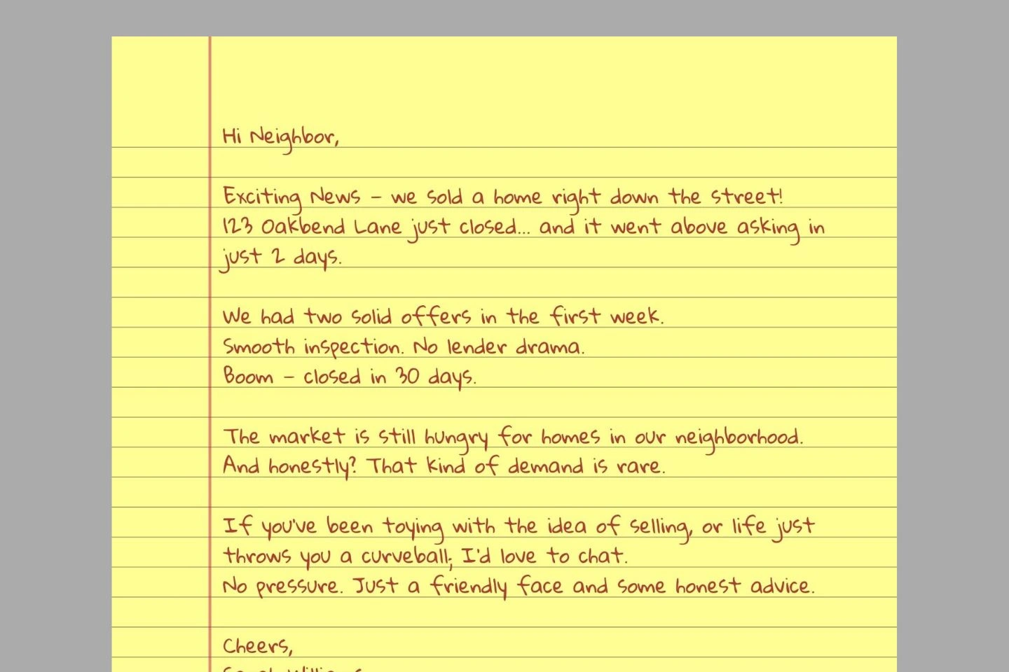
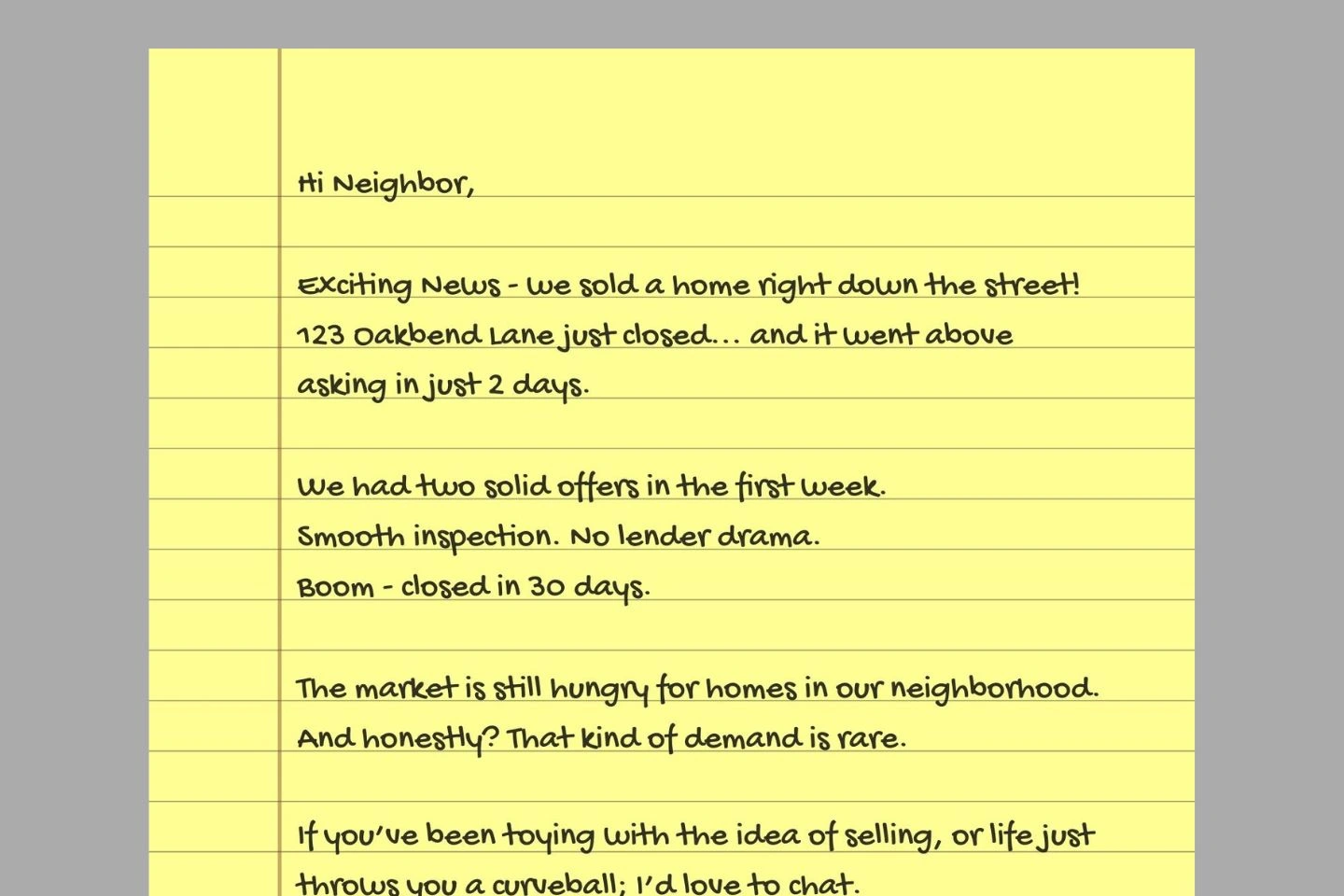
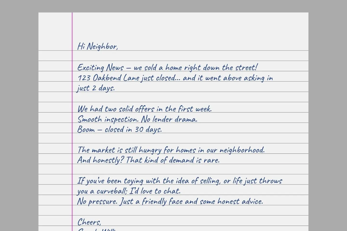
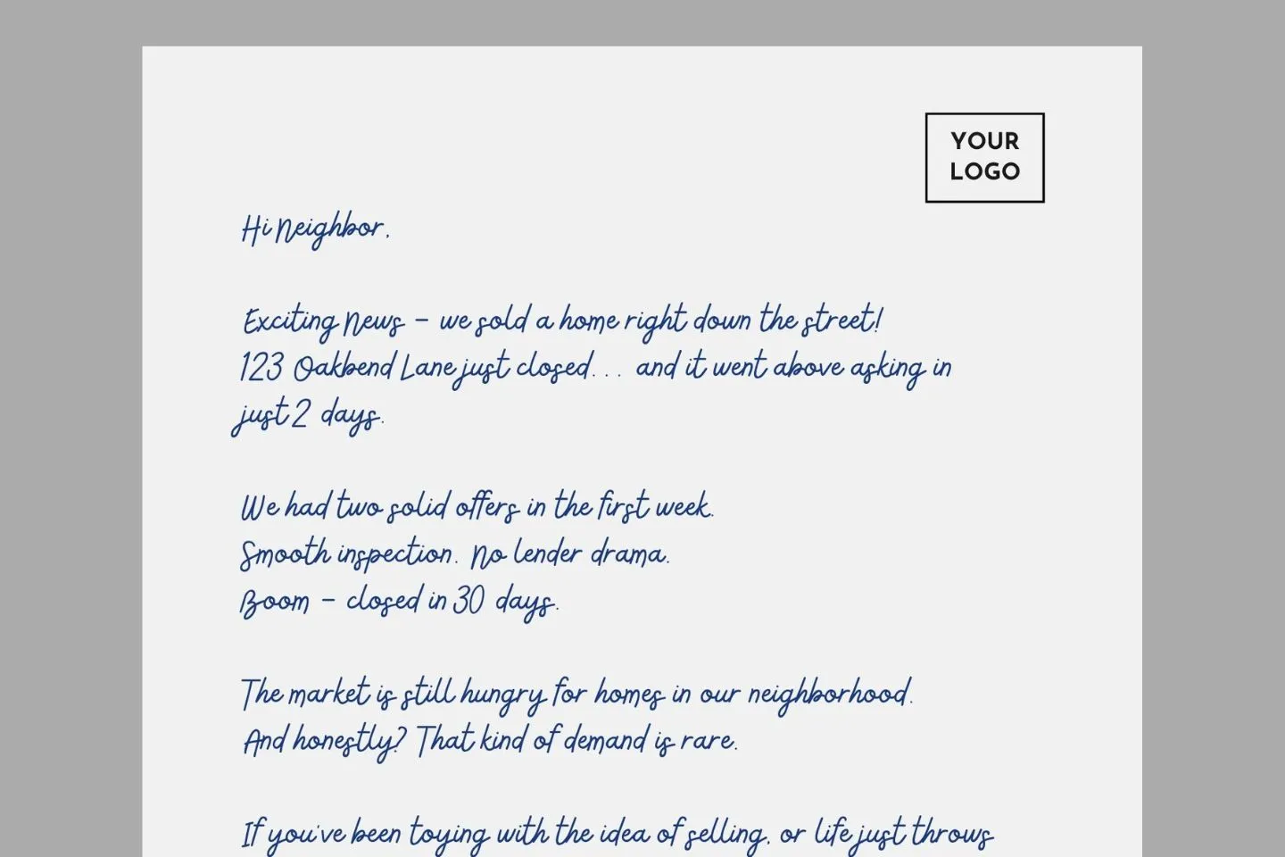
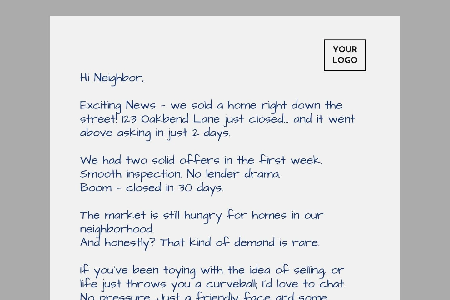
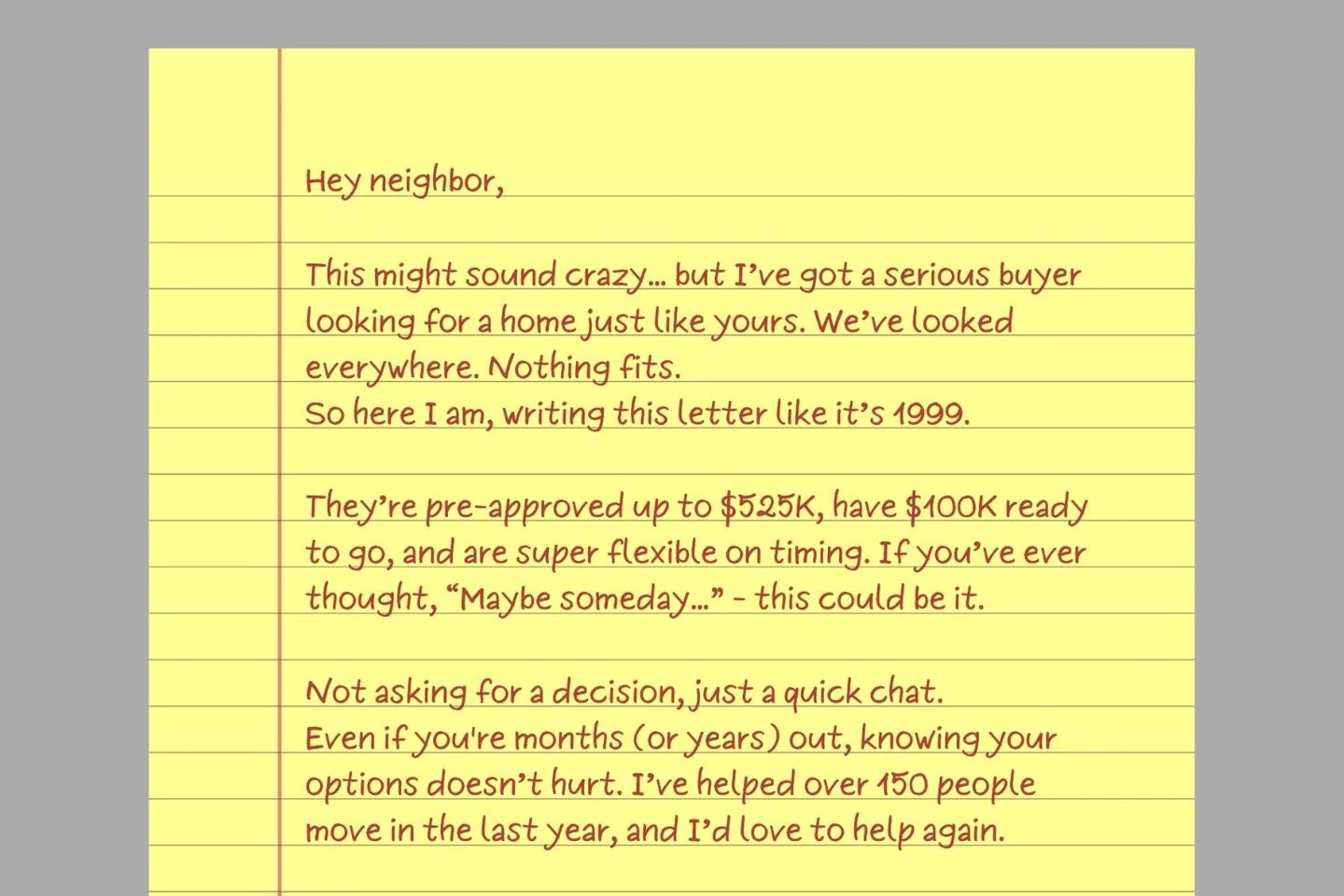
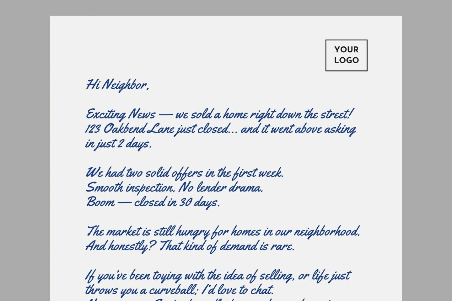
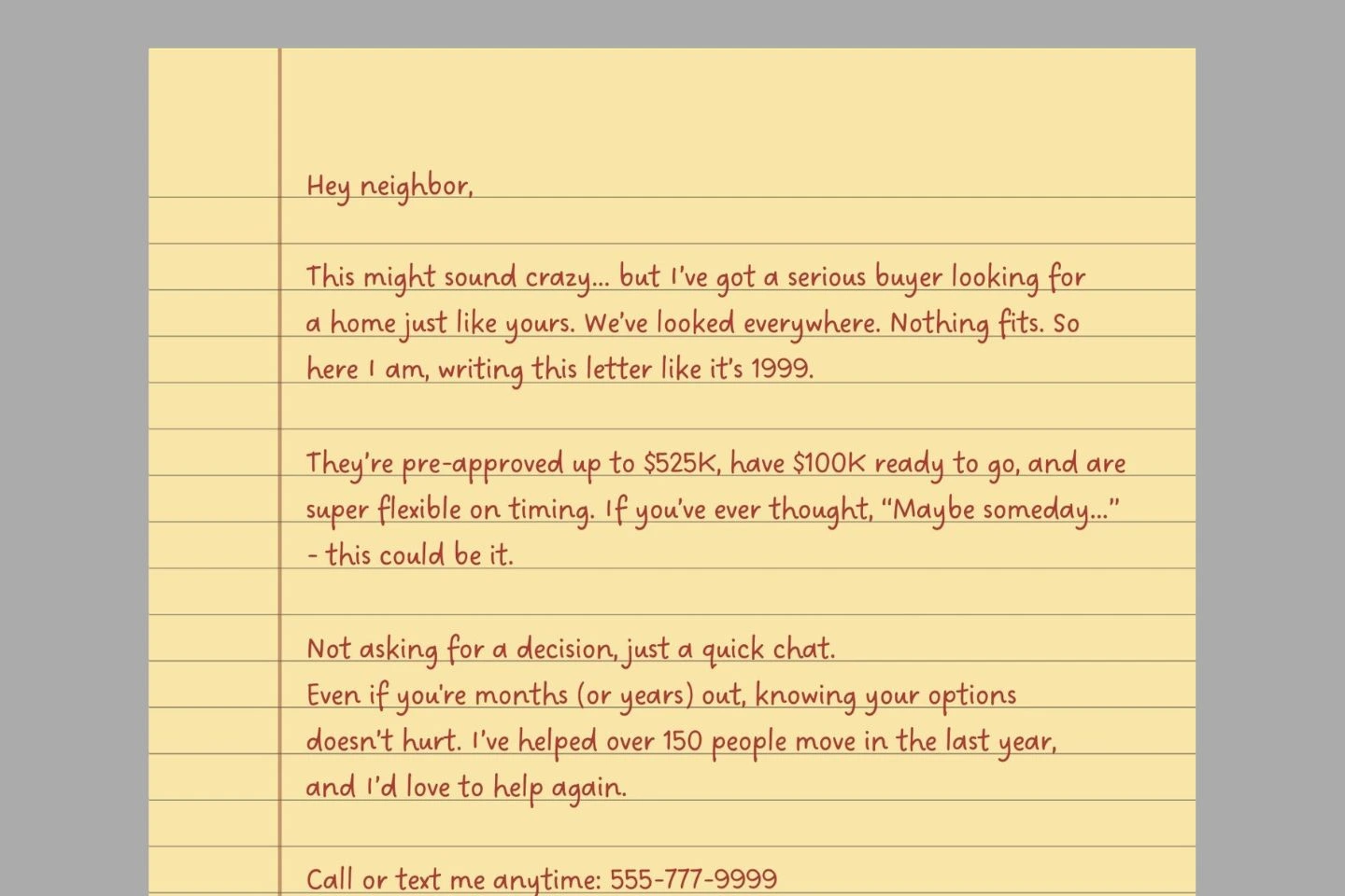
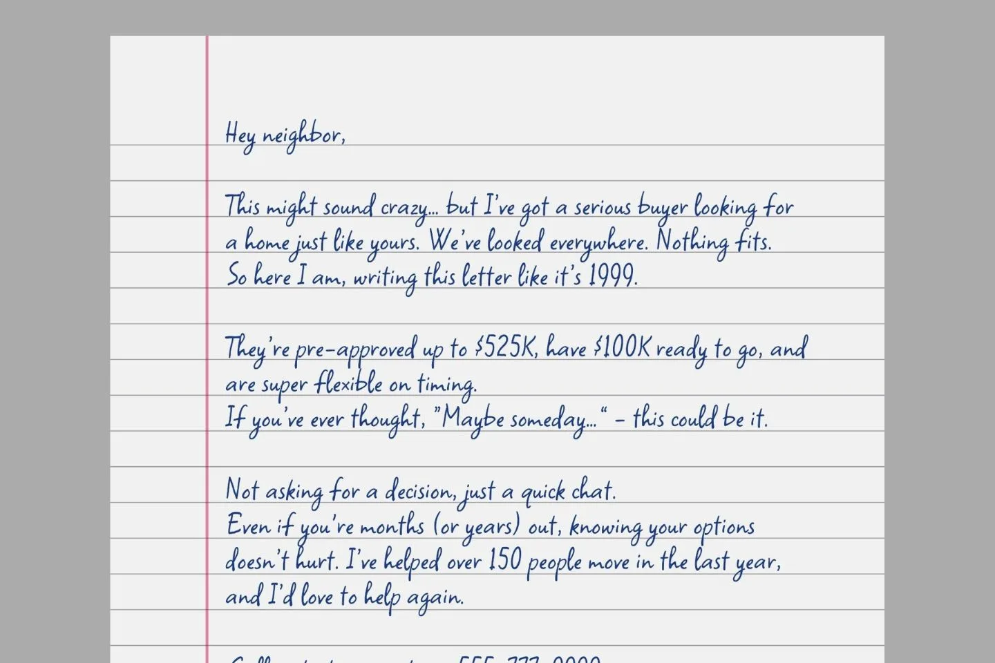
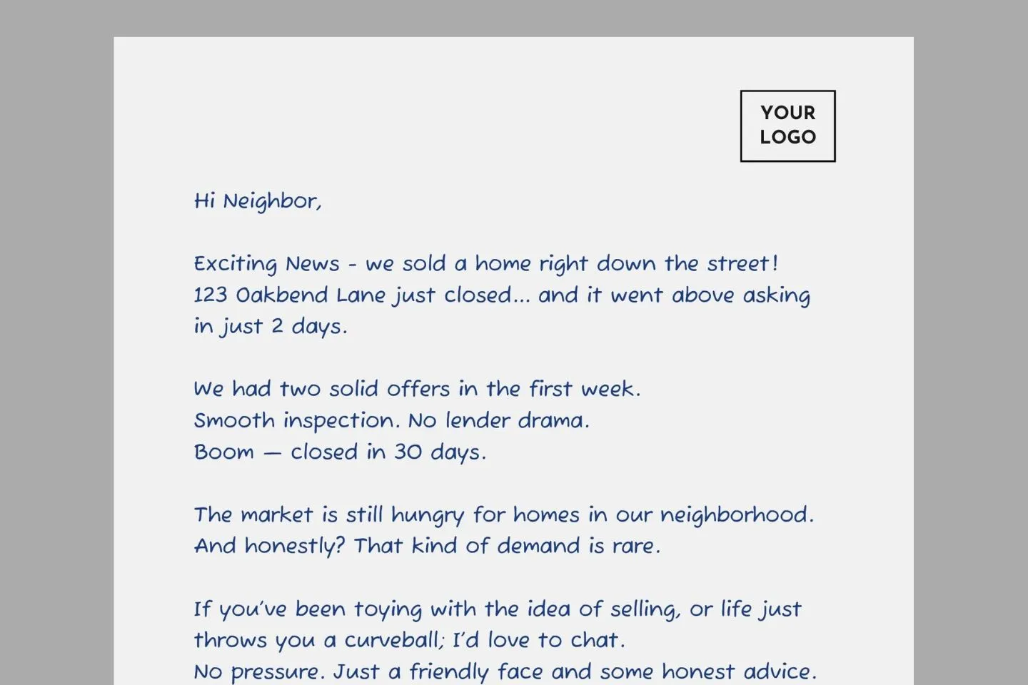
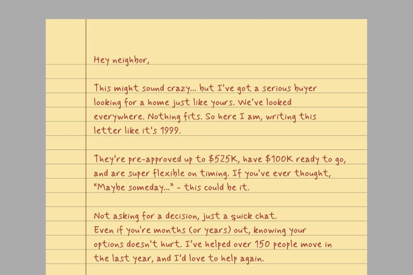
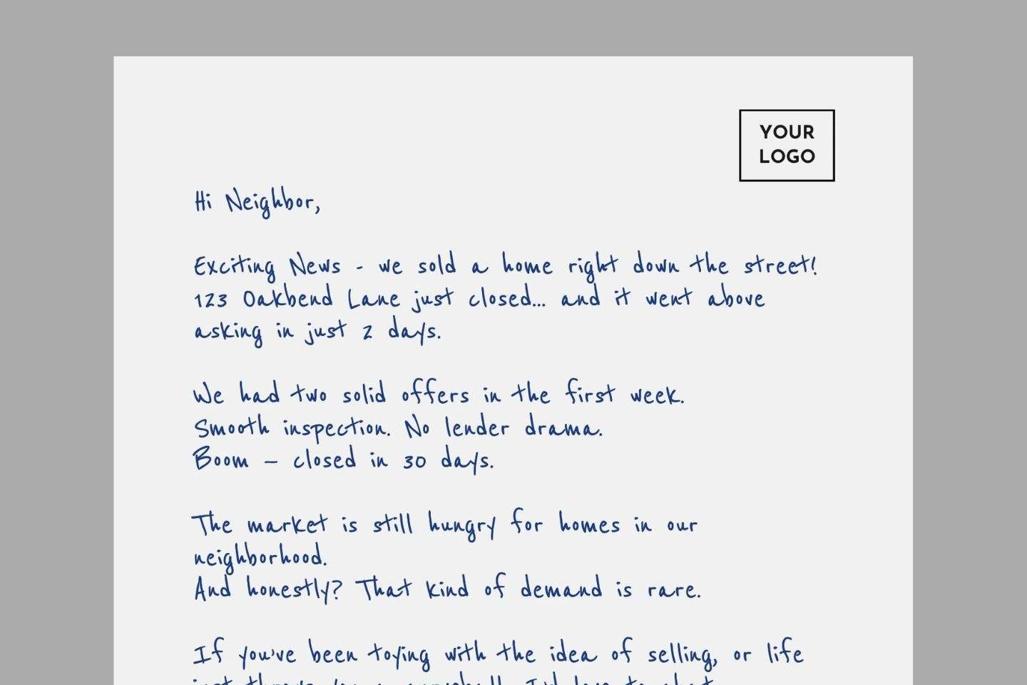
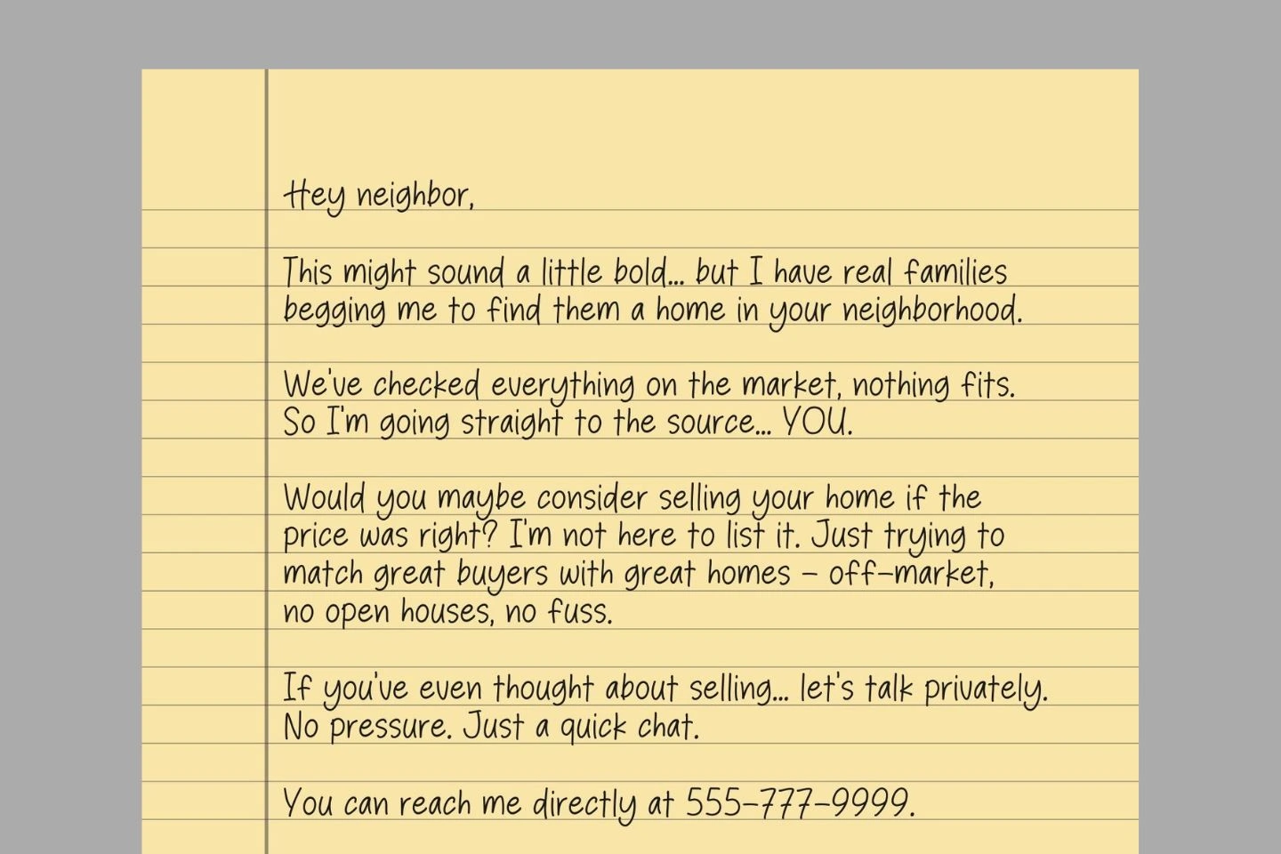
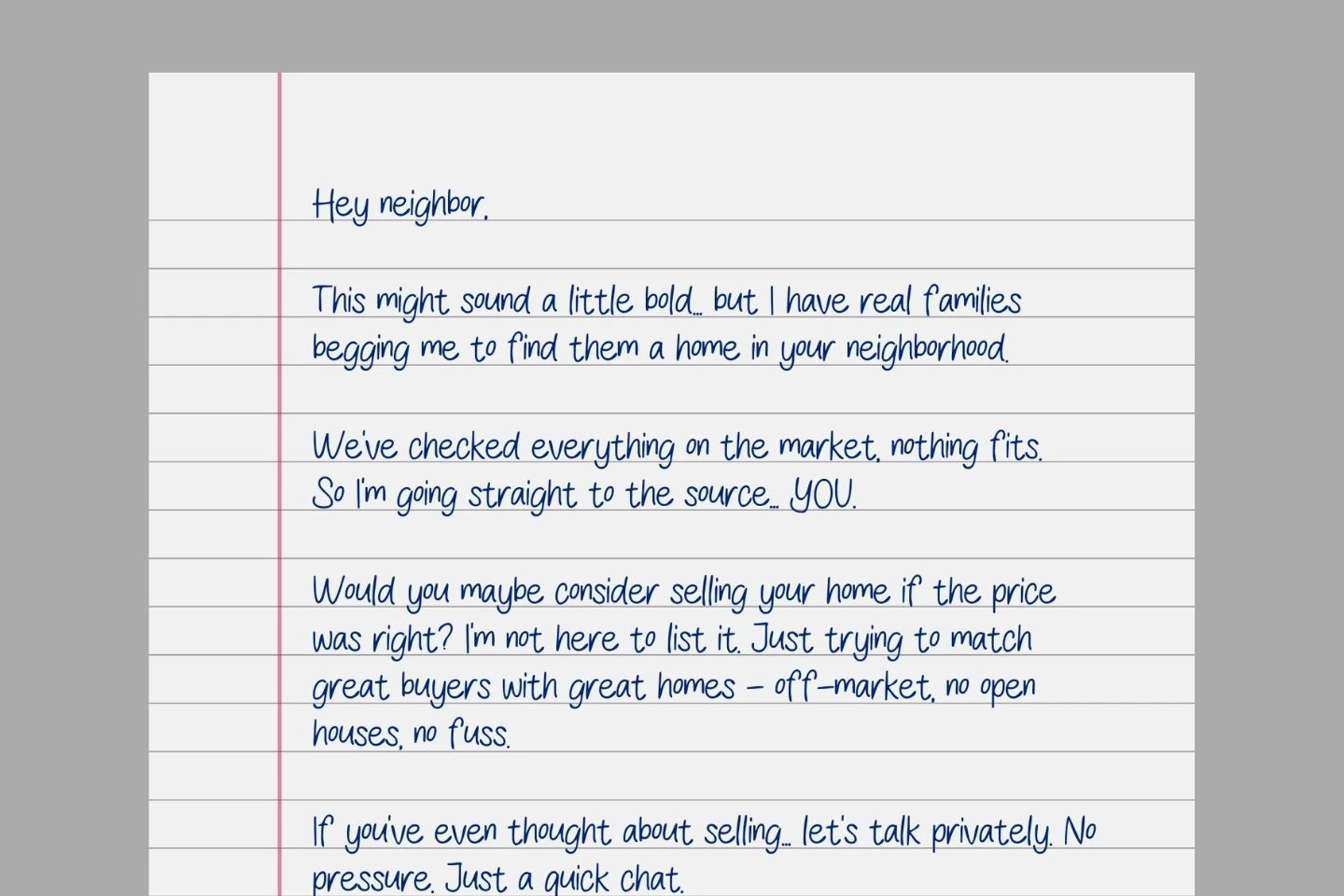
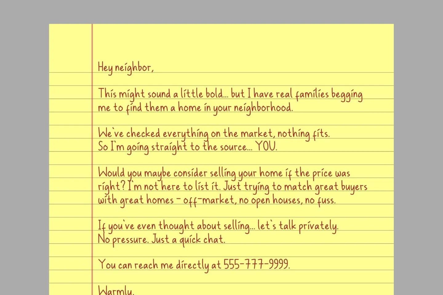
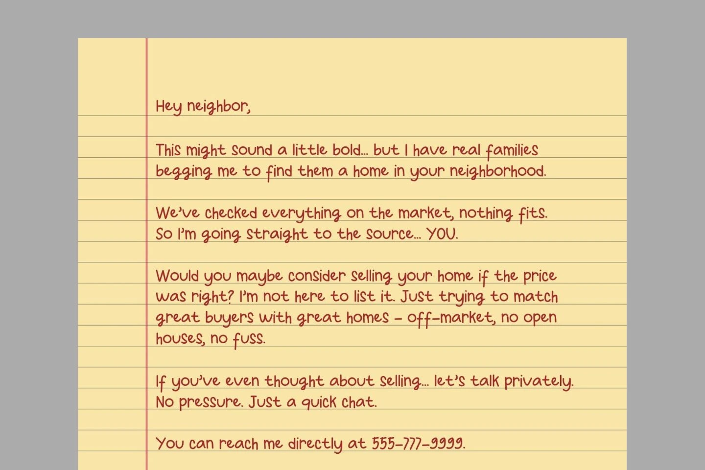
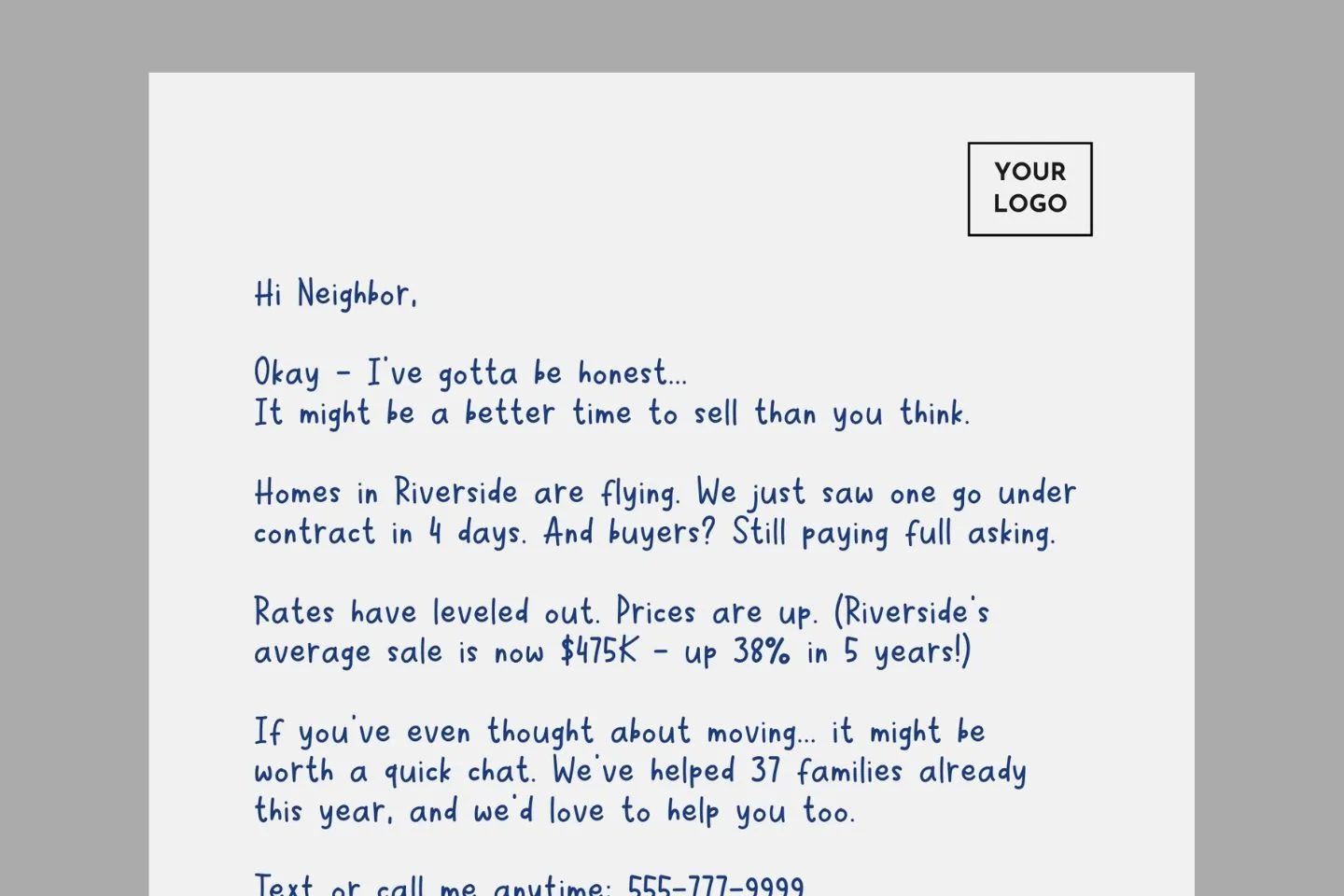
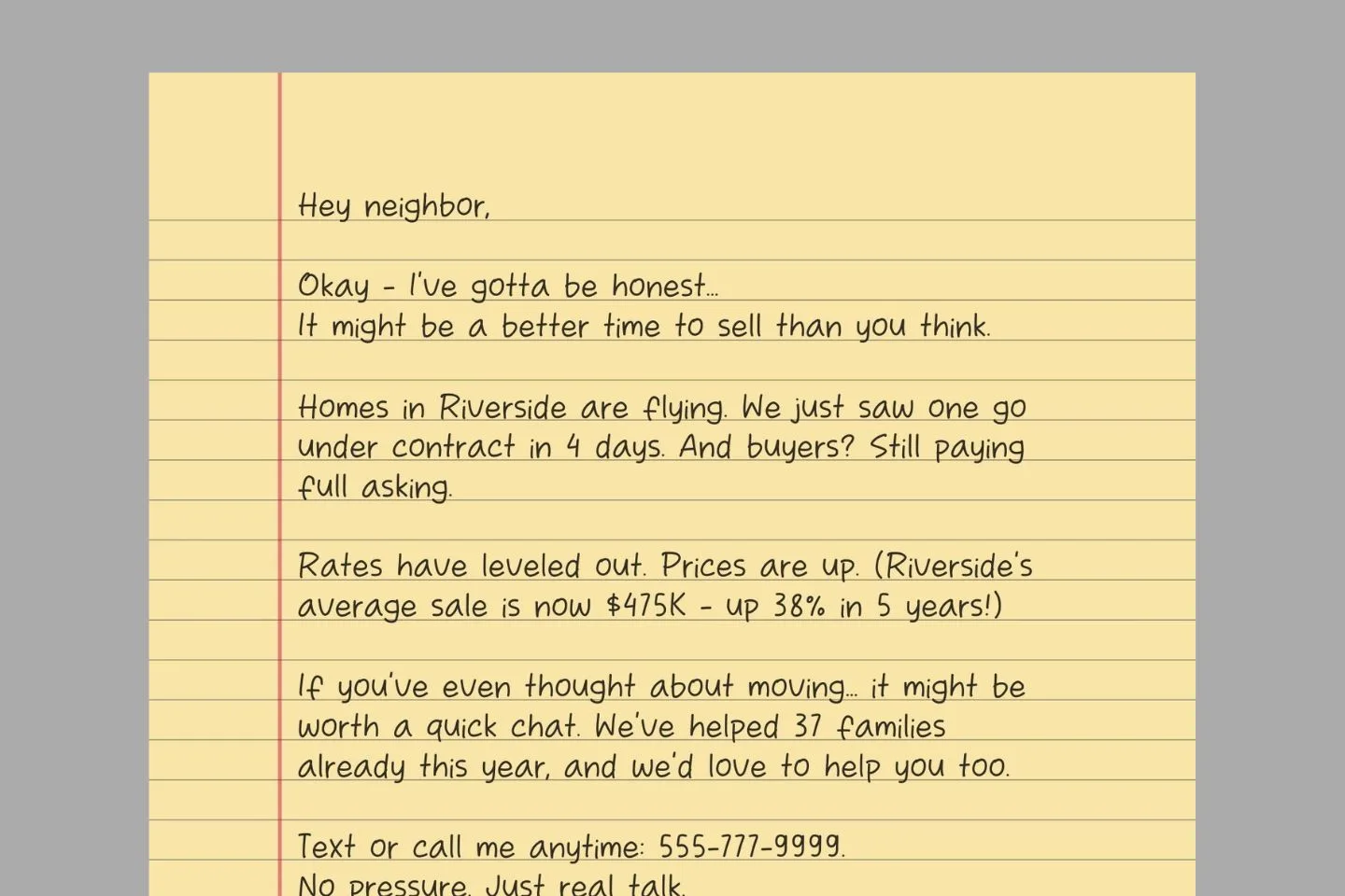
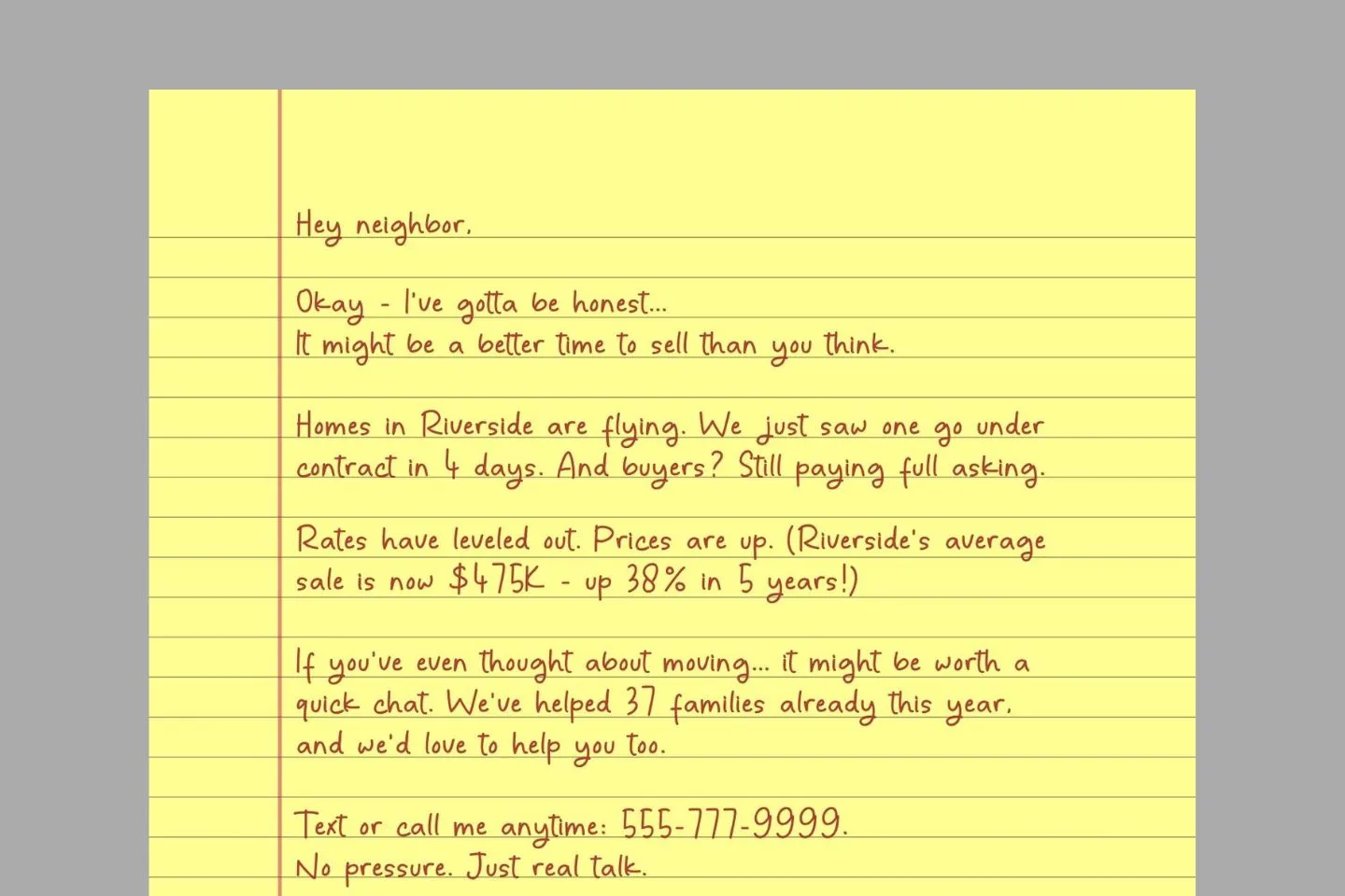
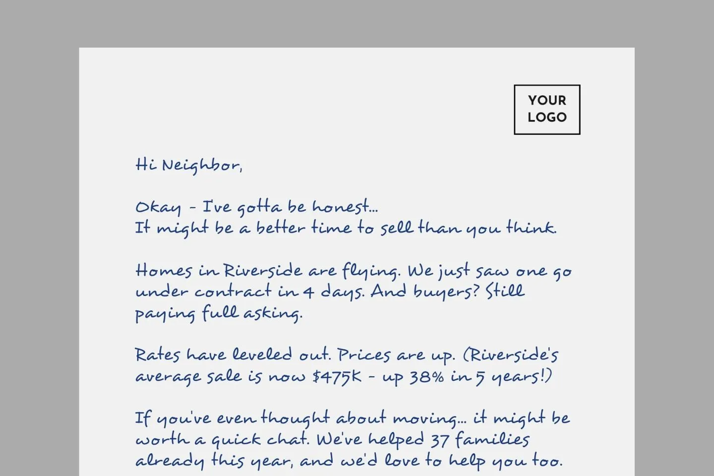
You can download the sample letters used in this document as a ready-to-use Canva Template. Already formatted with the perfect spacing, margins, and font sizes – just customize the text, print, and watch your response rates soar.